
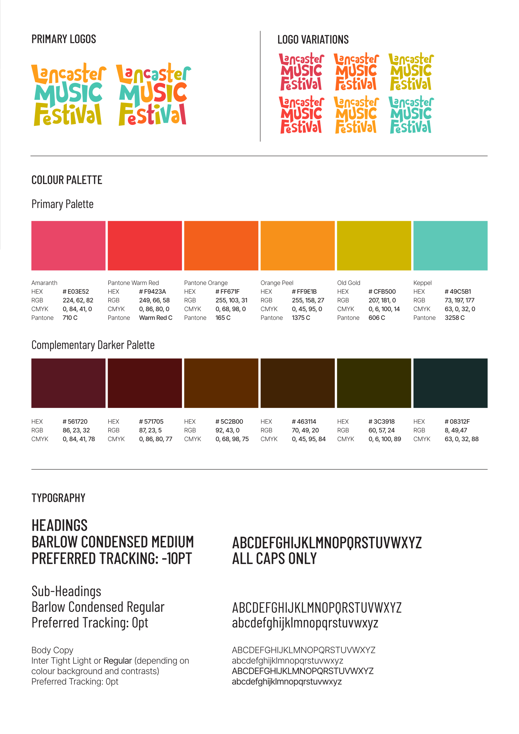
BRAND GUIDELINES
The intent behind Lancaster Music Festival’s branding is to reflect the sense of inclusivity, diversity, community and celebration behind the festival.
The logos and colours have been chosen to allow flexibility in future design direction and for the variety of venues that will need to incorporate the festival branding into their own marketing.
It is anticipated that each year’s fesitval will feature a different ‘theme’ or ‘design’ guided by the general flyer/brochure cover design. The designer can use their creative judgement to choose a theme that harmonises with the colours and style of the overall LMF brand.
Use of colours
The variety of brand colours available allows the design team creative freedom each year. It is not necessary to restrict designs to brand colours only, however incorporating one or two of the primary brand colours into the design theme each year will maintain an identifiable link with the overall brand.
Use of colour tints (lighter % versions of the primary palette) is suggested where lighter colour variations are needed, for example on backgrounds.
A set of complementary darker colours has been provided, which could be used for branded dark backgrounds or where darker feature text may be needed.
Use of logos
The coloured logos are best used against very dark or very light backgrounds where there will be sufficient contrast for them to display effectively.
If there is not sufficient contrast to allow a coloured logo version to display effectively against a background then the ‘reverse/white’ version of the logo should be used.
| Print jpg | Online jpg | Online png |
|---|---|---|
 |
 |
  |